We were approached by Choice Properties to give their old brand a re-boot. The only stipulations were that we had to use their current logo, a colour scheme of blue and pink and the typeface corbel.
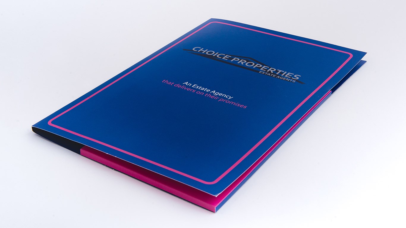
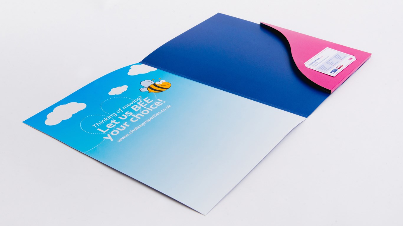
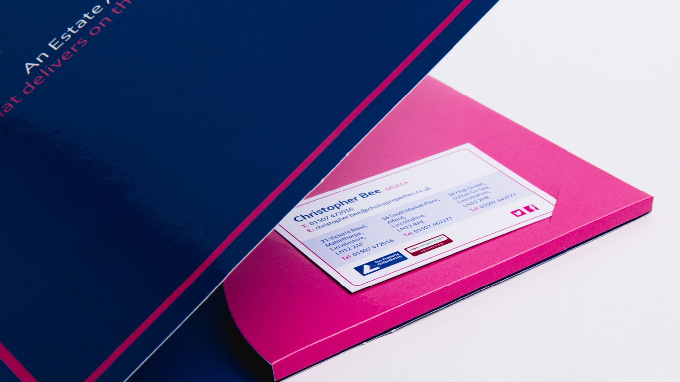
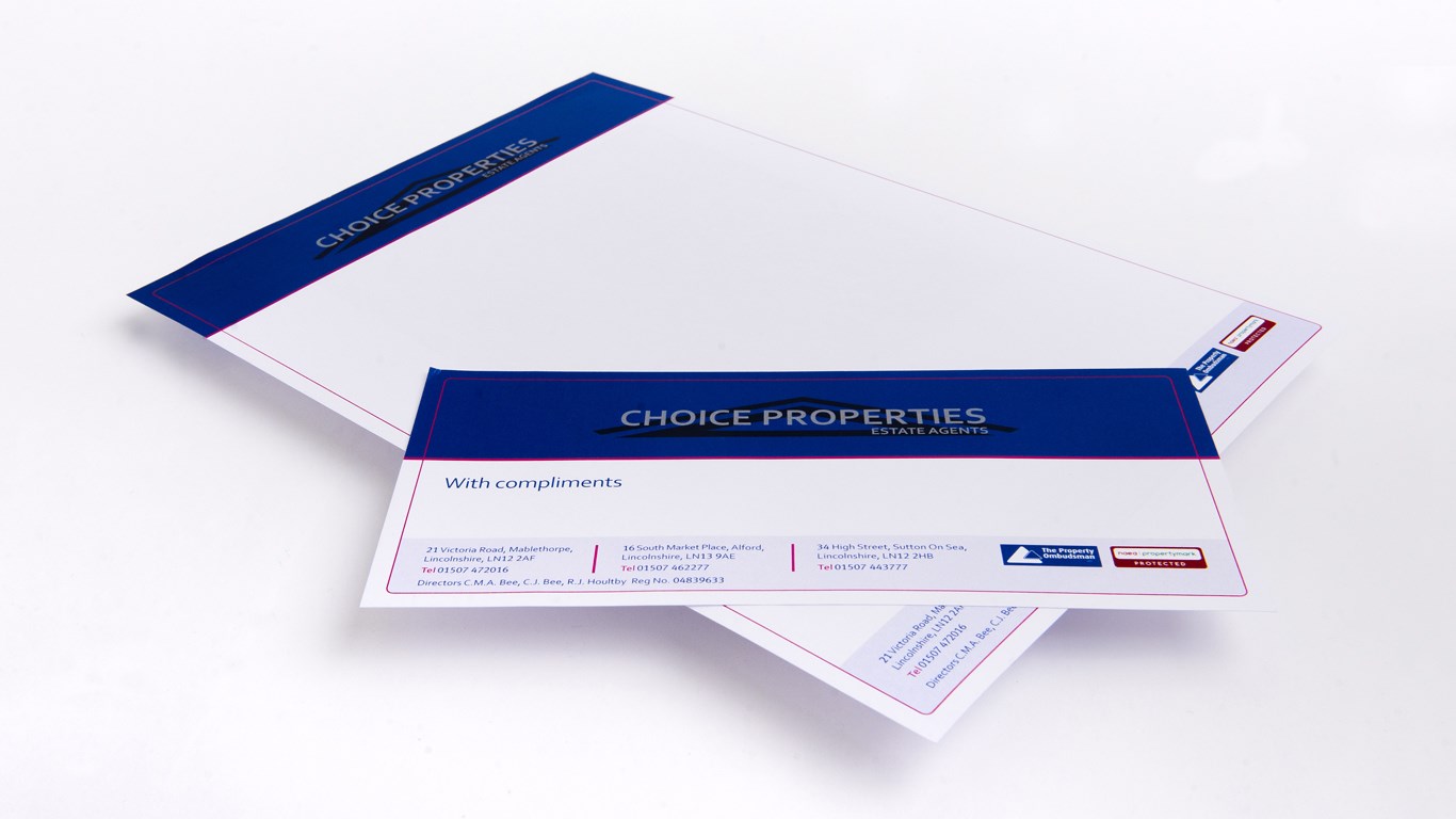
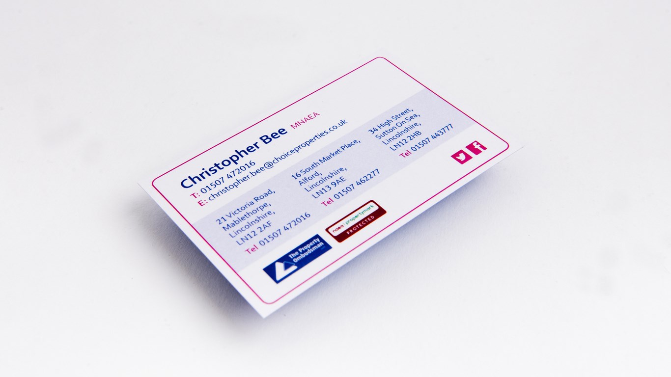
Items we re-branded as well as printed, ranged from letterheads, compliment slips, business cards, brochures, to their large format posters and completion folders. All boasting the most vibrant pink and royal blue we could find throughout. The addition of gloss lamination on the completion folder enhanced the depth and vibrancy of the pink. A business card slot was also added to the custom pocket to aid functionality along with a healthy capacity.
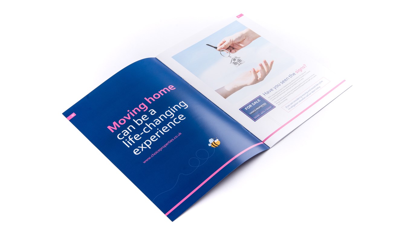
The client also asked that we make a link between the owners last name ‘Bee’, an illustration of a bumble bee and the phrase ‘LET US BEE YOUR CHOICE’. This can be seen throughout most of their promotional and client facing materials.
Talk to us 01507 606 661
Email us print@allinson.biz
Choice Properties
Re-Branding
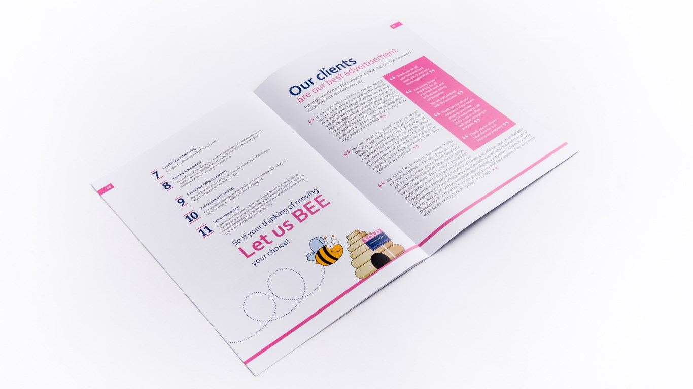
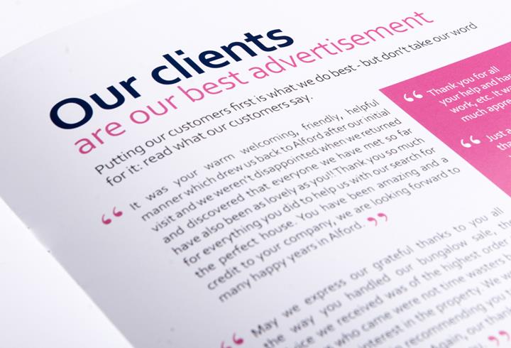
Choice Properties said:"We contacted Allinsons to re-brand our Estate Agency and they certainly delivered coming up with fresh, up to date ideas, they understood the brief and worked tirelessly to achieve a branding that we are proud of. "


