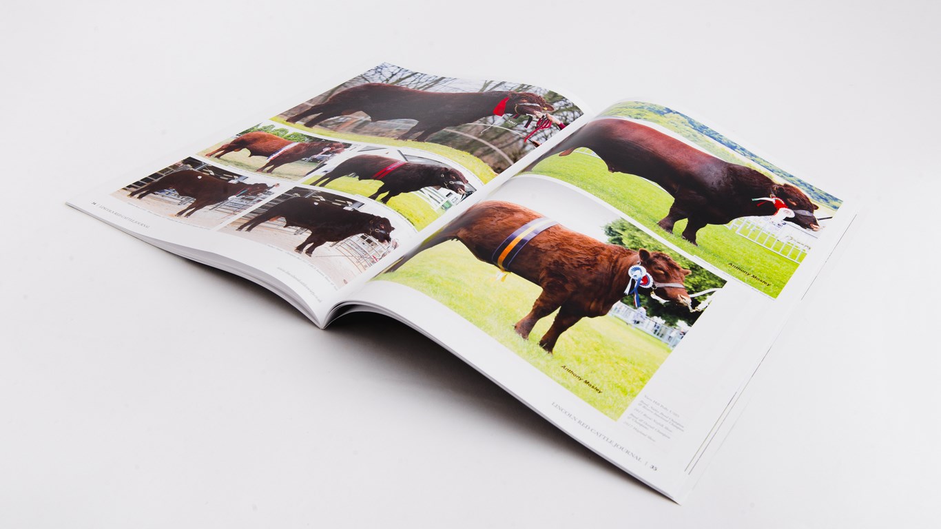
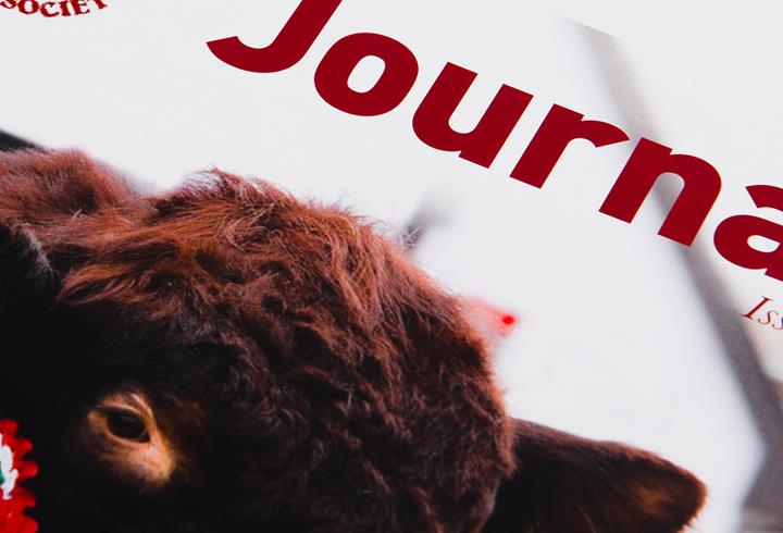
The Lincolnshire Red Cattle Society requested that we update their annual journal design, making it clean and legible but also keeping the personality of the previous issues. For this we introduced a clean white border around the page with a simple but informative footer. It boasts large photos and quotes to draw attention as well as delicate annotation of photos and illustrations. The use of the overly large tiles set in an old serif print captures the personality and nature of the breed and breeders. Alongside, we used DIN in the body copy to aid readability and keep the weight of type on the page light and cheerful. Baskerville was used for pull out quotes and image descriptions lending a sense of heritage to the journal overall. As the articles came from all round the world we felt each one deserved it’s own space so no articles appear on the same page, making the whole journal succinct and easy to read.